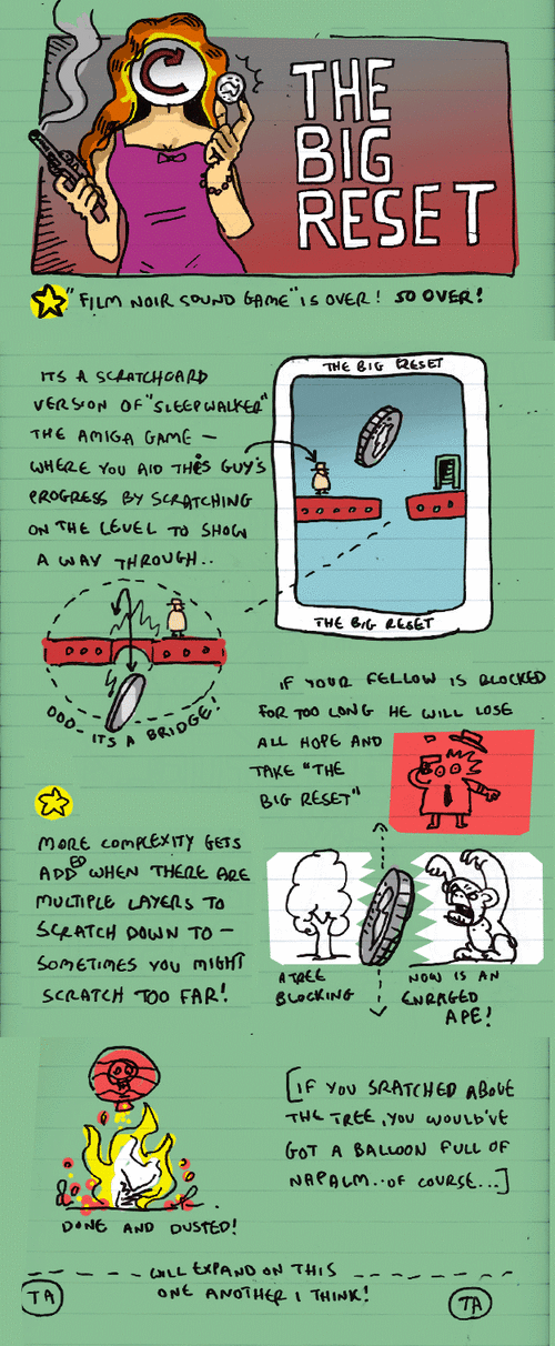
this is actually much classier than it looks folks. I like the idea of having to google ‘Quigley Down Under” to see if it’s worth getting over them tentacles for..
Every month, as part of the regular monthly meetings of the Austin, TX independent game community JUEGOS RANCHEROS, we do a very casual & chatty rundown of the ten or so games from the previous month — both local and global, and both indie and occasionally a bit-bigger-budget — for the audience, to give people — especially those curious onlookers from outside the indie community itself — a look at what they may have missed.
In keeping with the tongue-in-tobacco-packed-cheek tone, we call these run-downs A Fistful of Indies, which are be presented here on Venus Patrol for your reference, each fully-annotated, -linked, and off-the-cuff blurbed, in addition to their home on the JUEGOS RANCHEROS site.
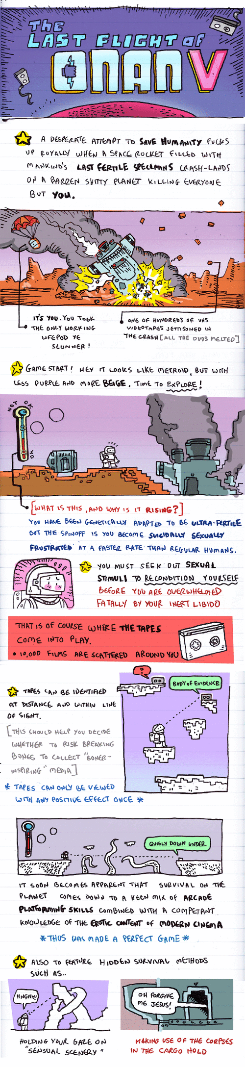
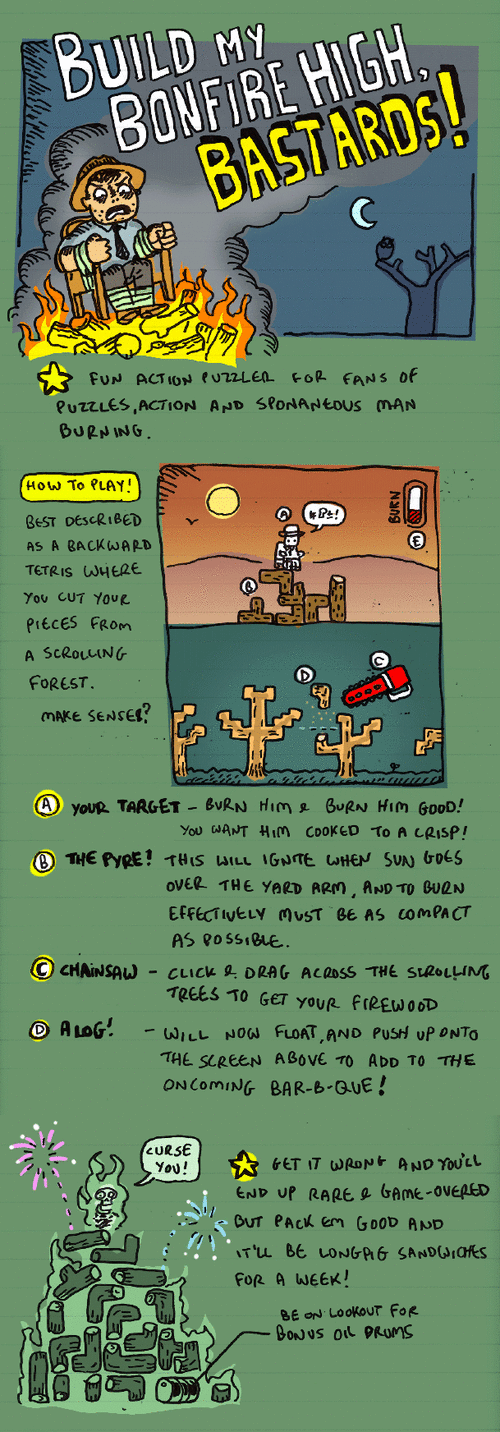
The thing i will miss most is doing that nice tall drawn font. I enjoyed drawing my lines with no gaps so they’d flood-fill effectively when scanned too. THAT is my HAPPENING.
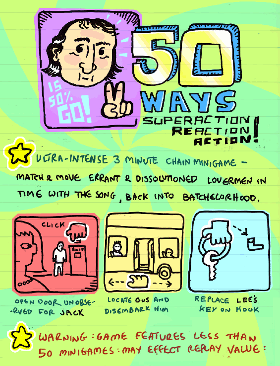
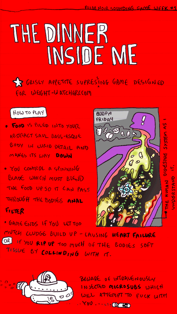
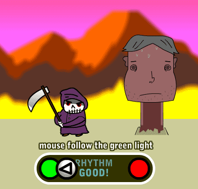
too much red ! ach.This does remind me of the time I made an “I’m a celebrity game” which never got used. It was a horribly over-sensitive Tetris with kangaroo cocks & whatnot, but I did get to draw on Kilroy-silk’s face which I know is a sexual fantasy for many. Cursor keys and HOW.